A Revised Spacing Chart
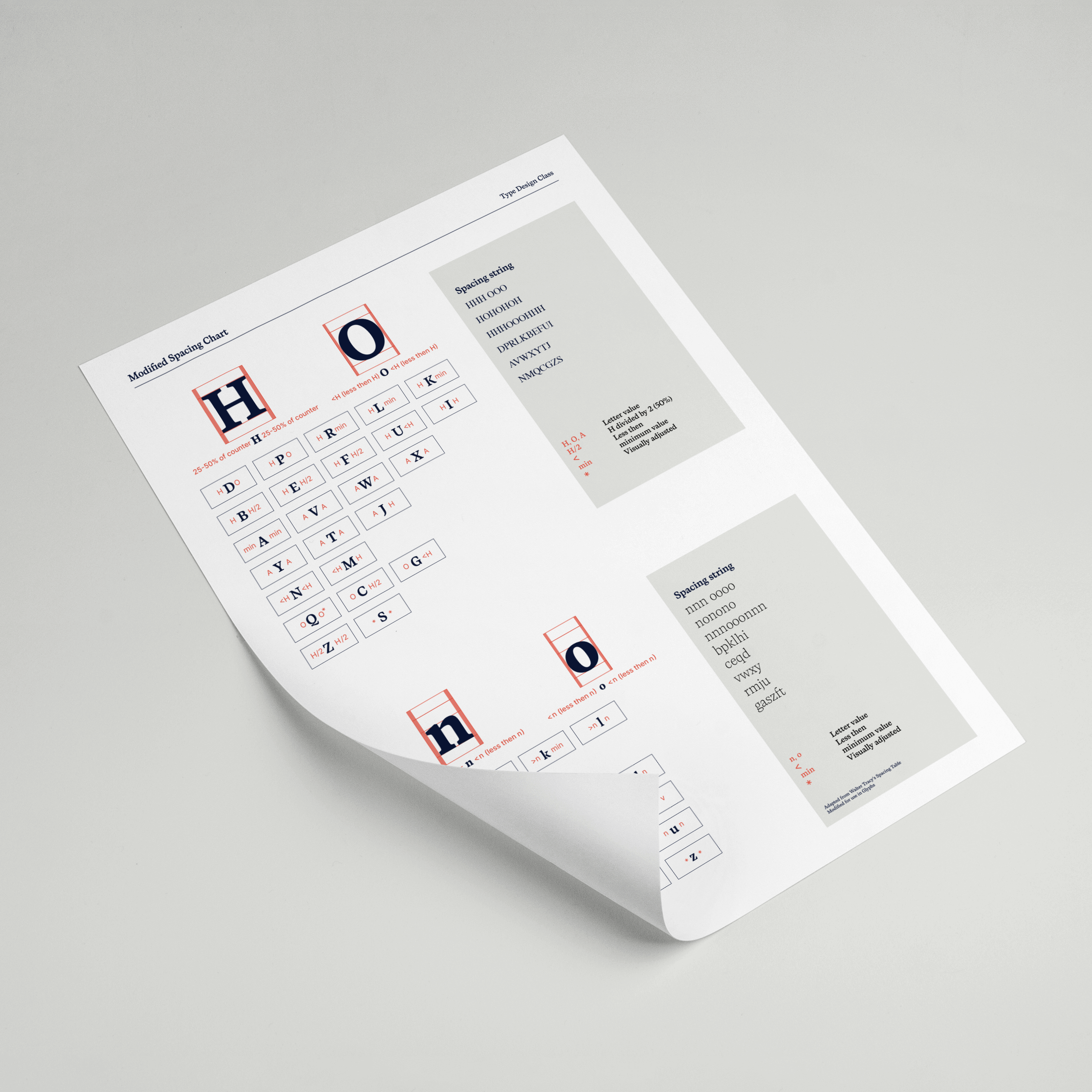
In the book ‘Designing Type’ by Karen Cheng there are a few spreads about spacing and kerning your font, which is one of the trickier and more time-consuming steps in the font-making process. I tried using that technique a few times, but I never really felt like the diagram was working for me.
So I changed it to a structure that was more practical. Make use of it to your benefit.
The issue
Designing Type contains a diagram that was created by Walter Tracy in 1986 and can be found there on page 55. It uses a numbering system of 1–7, which corresponds to the written text in the legend, to display the value for the left and right side bearings of a serif style character. Going back and forth between the legend and the letters takes time, and mistakes are inevitable.
My solution
In Glyphs, you can enter a number (let's say 50) to assign a value to a side bearing. You can also type a character, such as the letter ‘H’, that you have previously spaced. You don’t have to remember what the numbers mean if you replace the numbers 1 through 7 with a clear letter-value before and after each character.
So, <H means ‘less-than H’, ‘<O’ means ‘less-than O’. The values ‘A’, ‘O’, and ‘H’ are the values of the already set characters.
To get even more technical: if you only work in a single weight font in Glyphs, you can also type an ‘=’ before a letter-number value. =H-20, or =H/2 (H divided by 2) but it’s not recommended to do that if you work with multiple masters.
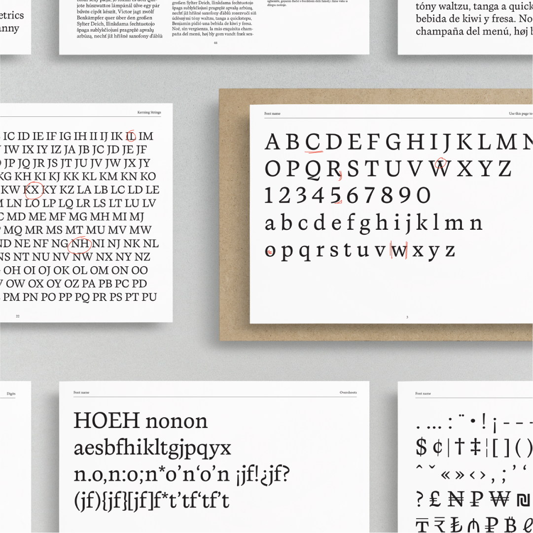
Download this free revised spacing chart and improve the spacing of your font


