Grids & Layout
Learn how to create professional looking layouts that provide structure and hierarchy in your design
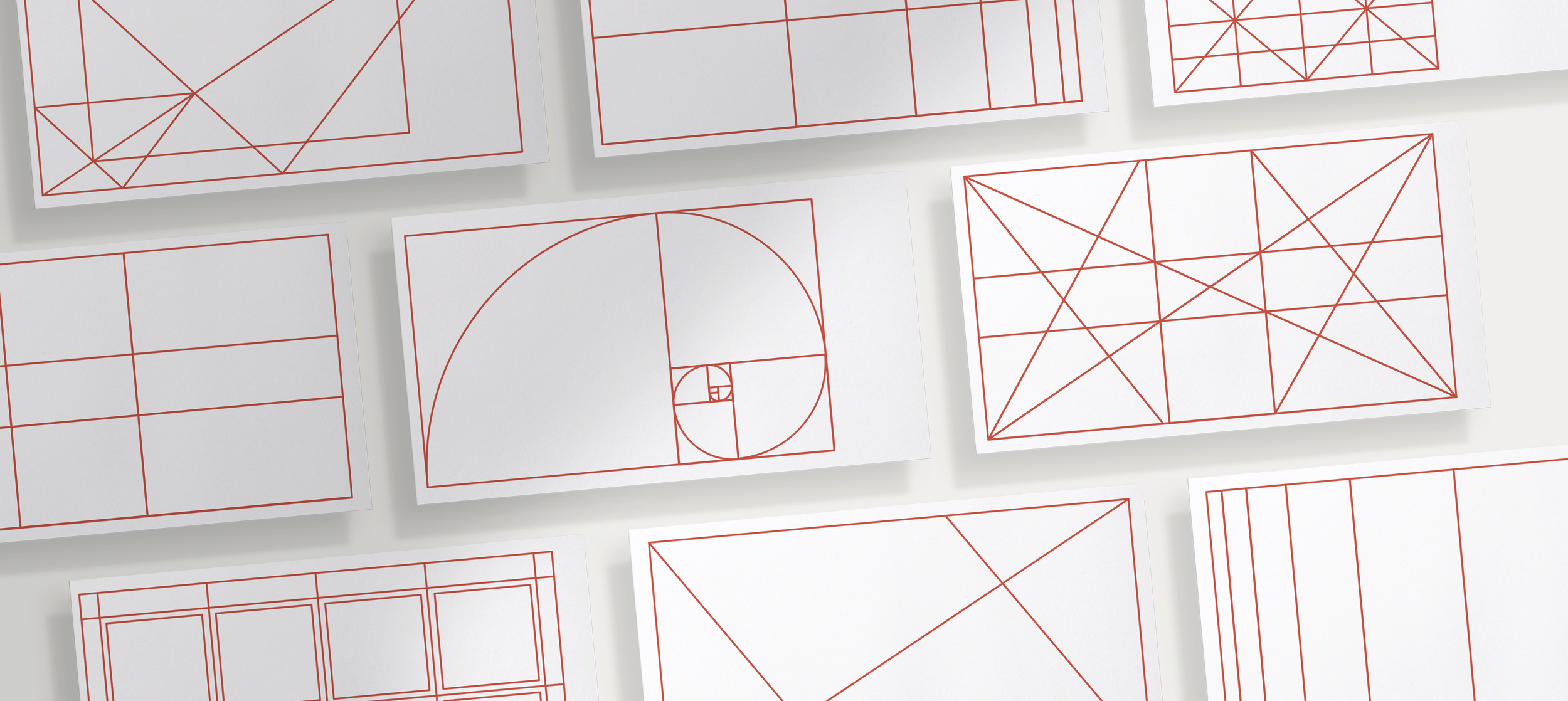
Modular Grid Templates
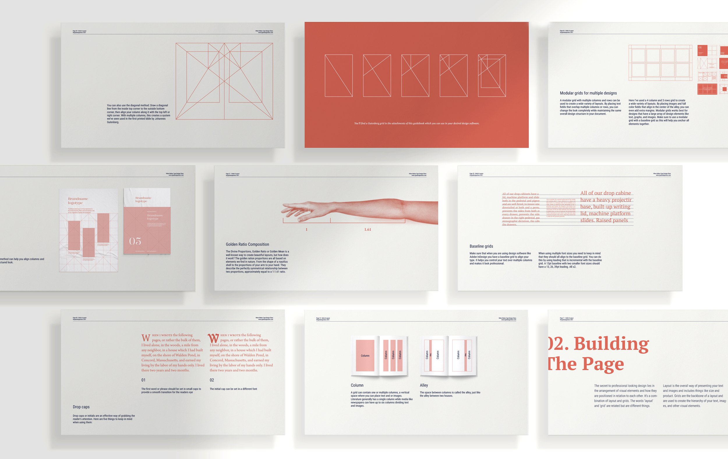
65 page Guidebook PDF
Adobe Illustrator/Photoshop Composition Overlays
Welcome to class
Everyone can look at a laid-out spread and judge if it’s professionally done, it’s harder to quantify that professionalism. Why do some layouts work and others do not? And more importantly, how can you recreate that professionalism?
Graphic design is as much an art as it is a science. In this guidebook, I will teach you the steps to creating professional-looking layouts filled with text and images. We’ll look at how the product you are designing for changes the layout, and how style changes are perceived by your audience. You’ll learn how to choose your fonts and how to layout a perfect single-column design for your text that is both pleasing to the eye and which has high readability because that’s where creating beautiful layouts starts: with typography.
Topics include: How to make and use grids, history of grids, rule of thirds, golden ratio, baselines, terminology, margins, columns and rows, typography, modular grids, images, print, and much more.
Free Bonus
Composition overlays for Adobe Illustrator
Transparent Composition overlays for Photoshop

This class is perfect for you when:
You want to create professional-looking layouts but don’t know how to do that
You want to have a solid foundation to work from
You want to upgrade your typesetting skills
What you will learn:
Create your perfect grids and layouts
Below every great design lays a great foundation. In this guidebook, you will learn how to create professional-looking grids for books, client proposals, social posts, and more.
In Grids & Layout, we will go through the process of looking at type and finding the right grid, columns, leading, and settings. You will learn by following step-by-step tutorials, in the same easy-to-understand structure, as my Instagram posts.
The Chapters
1. Typography (The basics)
A Typeface versus a Font, Display fonts, Serif versus sans serif, Font sizes, 12pt is the best font size
2. The anatomy of a grid
The anatomy of a grid, Column, Alley, Margin, Rows, Baseline grid, Line length and column width
3. Creating your grid
Width of the column, Alleys, Line spacing (or leading), Baseline grid, Rows
4. Professional compositions
Golden Ratio Composition, 4 steps to create a Golden Rectangle, Fibonacci Sequence, Rabatment Composition, Rule of thirds, Gestalt Theory
5. Artboard sizes
The A-Series, B-series, C-series, US-series
6. Practical Layout tips
Margins and white space, Cropping images, Modular grids for multiple designs, Drop caps, Justified text, Indents and outdents
“Loving the Grids & Layout guidebook! It's super complete and very understandable. Exactly what I needed.”
— Adriana Lemus, designer

Frequently Asked Questions
What tools do I need?
The guidebook comes in a screen-sized pdf, you’ll need Adobe Acrobat on your pc, mobile phone/iPad to open it. The transparent composition templates can either be opened in Adobe Illustrator or Photoshop.
Is this for web design as well?
There are many overlaps between layouts for web and print but this class is mainly focused on printed material like posters, books, client proposals, stationery, etc.
How long does this course take?
Because there are no videos and all content is digital, you can finish all modules at your own speed.
I’m a teacher, can I share this with my class?
No, this class is for one seat only. Meaning, every student needs to get their own license to use it. You can always email me at info@typedesignclass.com to discuss any discount for groups or companies.
How do I enroll in this class?
After purchasing Grids & Layout in the shop, you will receive an email with a download link for all content. Note: The download link is available for 24h only after your purchase.
What’s the entry-level as a designer?
This class is suited for any level as a designer. One of the things I love doing is breaking down complex study material into bite-sized pieces and making it easy to digest.
Hi, my name is Viktor Baltus
I’m a Dutch typedesigner with a passion for calligraphy and typography. I spent years learning the rules of type design and getting a feel for what makes fonts work. Now, I have decided to make the journey easier for type designers coming onto the scene now.
Since launching Type Design Class, I’ve had the privilege of helping over 2000 students learn the art of typography.
I teach in a clear and concise manner, so my students can grow quickly as designers. Whether you’re looking to pick up new design skills or just brush up on your knowledge, I’m here to help.
I’m proud to say that our platform has become one of the leading names in online typography courses, and I’ve even had the opportunity to partner with industry leaders like Glyphs, The Futur, Goodtype, and Fontself.
Grids & Layout
Learn how to create professional looking layouts that provide structure and hierarchy in your design
Adobe Illustrator/Photoshop Composition Overlays
65 page Guidebook PDF
Modular Grid Templates


